10 Top Common Web Design Mistakes to Avoid when building your first website
When it comes to building your first website, it’s important to avoid common web design mistakes that can hinder its success. Whether you’re creating a website for your business in Cape Town or starting a personal blog, understanding these pitfalls will help you create a polished and professional online presence. In this article, we will explore the top 10 web design mistakes that beginners should avoid, ensuring that your website not only looks great but also attracts visitors and serves its purpose.
From poor color choices to slow page load times, we will delve into each mistake and provide practical tips on how to overcome them. We’ll emphasize the importance of user experience, responsive design, clear navigation, and consistent branding, among other crucial aspects of web design. By implementing these best practices, your website will stand out in Cape Town and beyond.
Whether you’re using WordPress or building a custom website, these web design principles apply universally. Regardless of your industry or niche, having a well-designed website is essential for establishing credibility and engaging your target audience. So, let’s dive into the common web design mistakes to avoid and ensure your first website is a success.
Key Takeaways:
- Understanding common web design mistakes can help you create a polished and professional website.
- Key mistakes to avoid include poor color choices, slow page load times, and inconsistent branding.
- User experience, responsive design, and clear navigation are crucial elements for a successful website.
- Implementing SEO best practices and considering accessibility features are also important for web design.
- By avoiding these mistakes and following best practices, your website will stand out and attract visitors.
Importance of User Experience in Web Design
User experience (UX) plays a crucial role in the success of a website. When it comes to web design, prioritizing user experience is essential for attracting and engaging visitors. A well-designed user experience can make the difference between a website that converts visitors into customers and one that drives them away.
So, why is user experience so important in web design? It’s simple: users want a seamless, intuitive, and enjoyable browsing experience. They expect websites to load quickly, be easy to navigate, and provide the information they need. When these expectations are met, users are more likely to stay on a site longer, explore its content, and take the desired actions.
From a business perspective, a positive user experience can lead to higher conversion rates, increased customer satisfaction, and improved brand loyalty. It can also help in achieving higher search engine rankings, as search engines like Google prioritize websites that offer a good user experience.
Key Elements of a Good User Experience
Creating an exceptional user experience involves considering various factors that contribute to user satisfaction and engagement. Here are some key elements to focus on when designing a user-centric website:
- Website Speed: Slow-loading websites can frustrate users and lead to high bounce rates. Optimizing website speed is crucial to provide a seamless browsing experience.
- Responsive Design: With the increasing use of mobile devices, it’s important to ensure that your website is responsive and adapts to different screen sizes. This enhances usability and accessibility for users on smartphones and tablets.
- Intuitive Navigation: Clear and easy-to-use navigation is vital for users to find the information they’re looking for quickly. Well-organized menus and logical page structures improve user satisfaction.
- Engaging Content: Compelling and relevant content keeps users engaged and encourages them to stay on your website. High-quality visuals, informative articles, and interactive elements can enhance the overall user experience.
- Visual Design: Aesthetics matter in web design. A visually appealing website with consistent branding and an attractive layout can make a positive impression on users.
- Accessibility Features: Including accessibility features ensures that users with disabilities can easily navigate and interact with your website.
By incorporating these elements into your web design strategy, you can create a user experience that not only meets users’ expectations but also exceeds them. This, in turn, can contribute to the success and effectiveness of your website.
Remember, in web design, your goal should be to create a website that is enjoyable, intuitive, and user-friendly. Putting the user at the center of your design decisions is key to achieving this.
| User Experience Best Practices | Examples |
|---|---|
| Optimize website speed and page load times | Compress images, use caching techniques |
| Implement responsive design for mobile devices | Adapt layout for different screen sizes |
| Create clear and intuitive navigation | Use logical menus and breadcrumbs |
| Use engaging and relevant content | Include visually appealing graphics and videos |
| Ensure consistent visual design and branding | Use a cohesive color scheme and typography |
| Incorporate accessibility features for users with disabilities | Provide alt text for images, use keyboard-friendly navigation |
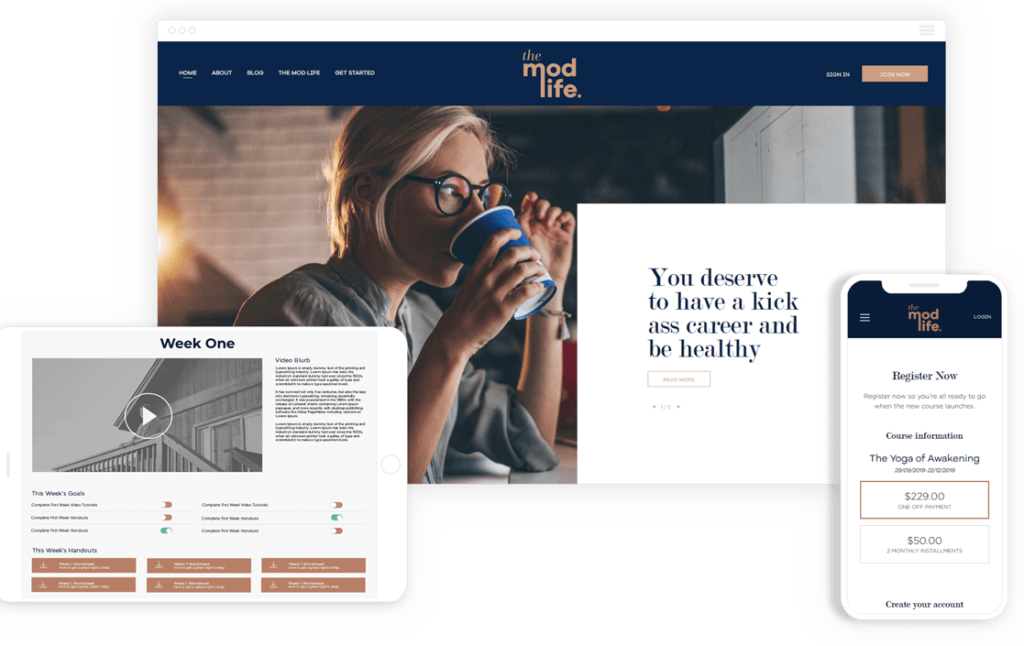
Responsive Design for Mobile Devices
With the rise in mobile usage, it has become crucial for businesses to prioritize responsive design when creating a website. Responsive design ensures that your website adapts to different screen sizes and provides an optimal user experience across various mobile devices.
Gone are the days when users solely relied on desktop computers to browse the internet. Today, people increasingly use their smartphones and tablets to access information, make purchases, and interact with websites. Recent studies show that mobile devices account for a significant portion of web traffic, making it essential for websites to cater to this audience.
Responsive design allows your website to automatically adjust its layout, content, and images to fit the screen size of the device being used. This means that whether a visitor is accessing your website from a small smartphone or a larger tablet, they will have a seamless user experience without having to zoom in or scroll horizontally.
Furthermore, responsive design plays a crucial role in search engine optimization (SEO). Search engines prioritize mobile-friendly websites in their rankings, meaning that if your website is not optimized for mobile devices, it may be penalized in search results. By implementing responsive design, you improve your website’s chances of ranking higher and attracting more organic traffic.
By investing in responsive design, you not only enhance the user experience for mobile users but also future-proof your website as technology continues to evolve. With the rapid advancements in mobile devices, it is crucial to stay ahead of the curve and ensure that your website remains accessible and user-friendly across all devices.
The Benefits of Responsive Design:
- Improved user experience across mobile devices
- Higher search engine rankings
- Increased organic traffic
- Future-proofing your website
Responsive design allows your website to automatically adjust its layout, content, and images to fit the screen size of the device being used.
In conclusion, responsive design is no longer an option but a necessity for modern web design. By optimizing your website for mobile devices, you can provide an exceptional user experience, improve your search engine rankings, and attract more visitors to your site. Embrace responsive design and unlock the full potential of your website.
Slow Page Load Times
Page load times play a crucial role in user experience and website performance. When your web pages take too long to load, it can lead to a negative user experience and high bounce rates. Visitors expect quick access to the information they are seeking, and any delays can result in frustration and abandonment.
There are several reasons why your website may have slow load times. One common factor is large file sizes, especially for images and videos. When these files are not optimized for the web, they can significantly slow down page loading. Additionally, heavy use of JavaScript and CSS files, as well as excessive server requests, can contribute to slow load times.
To improve your website’s performance and enhance page load times, consider the following tips:
- Optimize your images: Compress and resize images appropriately without compromising the quality. Use image compression tools to reduce file sizes, ensuring faster load times without sacrificing visual appeal.
- Minify CSS and JavaScript: Reduce the size of your CSS and JavaScript files by removing unnecessary whitespace, comments, and code. Minification helps improve load times by reducing file sizes.
- Enable browser caching: Configure your website to leverage browser caching, allowing returning visitors to load your web pages more quickly. Caching enables the browser to store static files, reducing the need for repeated downloads.
- Choose a reliable hosting provider: Ensure your website is hosted on a server with sufficient resources and good uptime. A reliable hosting provider can significantly impact your website’s performance and load times.
- Implement content delivery networks (CDNs): CDNs distribute your website’s static files across multiple servers worldwide, reducing the physical distance between the server and the user. This results in faster load times, especially for users in different geographical locations.
By implementing these strategies, you can effectively improve your website’s performance, enhance page load times, and deliver a seamless user experience.
Example of Before and After Optimization
| Website Component | Before Optimization (File Size) | After Optimization (File Size) |
|---|---|---|
| Homepage Image | 2.5 MB | 580 KB |
| JavaScript File | 800 KB | 150 KB |
| CSS File | 300 KB | 60 KB |
| Total Page Size | 4 MB | 790 KB |
Inconsistent Branding and Design
Consistency in branding and design is crucial for creating a professional and trustworthy website. When your website’s branding and design elements are inconsistent, it can lead to confusion and a lack of credibility. Visitors may question the legitimacy of your website and be less likely to engage with your content or make a purchase.
Branding encompasses various elements, including your logo, color palette, typography, and overall visual identity. By maintaining a consistent brand presence across your website, you create a cohesive and memorable experience for users. This consistency helps to reinforce your brand image while establishing trust and recognition.
Design consistency extends beyond branding to include layout, navigation, and overall user experience. Keeping a consistent design throughout your website ensures that users can navigate easily and understand how to interact with different elements. It also improves the overall user experience, making it more enjoyable and intuitive for visitors to engage with your content.
When designing a website, consider the following tips for maintaining consistent branding and design:
- Develop a clear brand identity, including a logo and visual style guide.
- Use consistent colors, fonts, and typography across all pages and elements.
- Create a standardized layout and navigation structure for easy navigation.
- Ensure that images and visuals align with your brand aesthetic.
- Regularly review and update your website to ensure consistency is maintained.
Having a consistent branding and design approach not only enhances the visual appeal of your website but also reinforces your brand identity and builds trust with your audience.” – Marika Johnson, Web Designer
Lack of Clear Navigation
Having clear navigation is crucial for users to easily find information on your website. It not only improves the user experience but also helps search engines understand your site’s structure. Here are some tips to create an intuitive navigation structure:
- Keep it simple: Avoid overwhelming users with too many menu options. Stick to the essential pages and group related content together.
- Use descriptive labels: Make sure your navigation labels accurately describe the content they link to. Avoid generic terms that don’t provide clarity.
- Consistent placement: Position your main navigation in a prominent location, such as the top or side of your website. Users expect to find navigation menus in these areas.
- Include a search bar: A search bar can supplement your navigation menu, allowing users to quickly find specific content.
- Highlight active pages: Use visual cues, such as highlighting or underlining, to indicate the current page or section that users are on.
“Clear navigation is like a roadmap that guides users through your website. With intuitive navigation, users can effortlessly explore and discover the content they are looking for.”
By implementing these tips, you can create a user-friendly and easily navigable website, ensuring visitors can find the information they need without any confusion.
| Common Navigation Mistakes | Best Practices |
|---|---|
| Poorly labeled navigation links | Use descriptive labels that accurately represent the content |
| Too many menu options | Keep the main navigation simple and concise |
| Hidden or hard-to-find menus | Ensure the navigation is prominently displayed and easy to locate |
| Confusing hierarchy and structure | Organize and group related content logically |
| No visual cues for active pages | Highlight the current page or section in the navigation |
Poor Color Choices and Contrast
When it comes to web design, the color choices you make and the level of contrast you achieve can significantly impact the overall user experience. The right combination of colors can enhance readability, draw attention to important elements, and create a visually appealing website. On the other hand, poor color choices and lack of contrast can lead to user frustration, difficulty reading content, and a negative impression of your brand.
It is essential to select appropriate colors that align with your brand identity, target audience, and the purpose of your website. Consider the psychology of colors and how they evoke different emotions and reactions. For example, warm colors like red and orange can create a sense of energy and urgency, while cool colors like blue and green can evoke calmness and tranquility. Choose colors that resonate with your website’s goals and reflect the desired user experience.
Contrast is equally important in web design as it helps to differentiate between various elements on the page. It ensures that the text is easily readable and that important information stands out. High contrast between the background and text improves accessibility, especially for users with visual impairments. Conversely, low contrast can strain the eyes and make it challenging to discern content.
When considering color choices and contrast, keep in mind the following tips:
- Ensure that text is easily readable against the background color by choosing a suitable text color and background color combination with sufficient contrast.
- Use contrasting colors for important elements such as headlines, calls to action, and navigation menus to make them stand out.
- Avoid using too many colors that can create visual clutter and confusion. Stick to a cohesive color scheme that complements your brand and content.
- Test your color choices and contrast by viewing your website on different devices and screen resolutions to ensure readability and visual appeal across different platforms.
| Color Choice and Contrast | Impact on User Experience |
|---|---|
| High Contrast | Enhanced readability and accessibilityClear distinction between elementsImproved focus on important information |
| Low Contrast | Enhanced readability and accessibilityClear distinction between elements improved focus on important information |
By paying attention to color choices and contrast in your web design, you can create a visually appealing and user-friendly website that effectively communicates your brand message. Remember to consider the preferences of your target audience and test your colors and contrast to ensure the best possible user experience.
Overwhelming Visuals and Cluttered Layouts
When it comes to web design, it’s important to strike a balance between visuals and content. While visuals can enhance the overall aesthetic of your website and create an engaging user experience, overloading your site with too many visuals and a cluttered layout can have the opposite effect, confusing and overwhelming your visitors.
Visitors to your website should be able to easily navigate and find the information they are looking for without feeling overwhelmed by a busy or cluttered design. A cluttered layout can make it difficult for users to focus on the main content and may lead to higher bounce rates as users struggle to find what they need.
Instead, consider using visuals strategically to guide your visitors’ attention and highlight key information. This can be done through the use of clear and concise calls to action, informative graphics, and well-organized content. By incorporating visuals thoughtfully and intentionally, you can create a visually appealing website that enhances the overall user experience.
Strategies for Balancing Visuals and Content:
- Use visuals to support and enhance your content, rather than overpowering it.
- Ensure that each visual element serves a purpose and contributes to the clarity of your message.
- Avoid cluttering your layout with too many visuals or overlapping elements.
- Optimize images and media files to maintain fast load times and prevent delays in page rendering.
- Consider the hierarchy of your content and use visual elements to guide users’ attention to important information or actions.
- Maintain consistency in your design elements, such as color schemes and typography, to create a cohesive and visually appealing website.
By implementing these strategies, you can ensure that your website’s visuals contribute to a positive user experience, rather than overwhelming your visitors.
| Common Mistakes | Best Practices |
|---|---|
| Using too many images or graphics that do not serve a clear purpose | Ensure that each visual element supports the content and enhances the user experience. |
| Overlapping elements, making the layout cluttered and difficult to navigate | Maintain a clean and organized layout that allows users to easily find the information they need. |
| Slow page load times due to excessive use of high-resolution images | Optimize images and media files to minimize load times and improve overall website performance. |
| Mixing too many design styles or inconsistent branding | Maintain a consistent design language and branding throughout your website to create a cohesive and professional look. |
Lack of Call-to-Action Elements
When it comes to web design, call-to-action elements play a critical role in driving user engagement and conversions. These elements are strategically placed on your website to guide visitors toward taking specific actions that align with your goals. Whether it’s signing up for a newsletter, making a purchase, or contacting your business, effective call-to-action elements can significantly impact the success of your website.
Without clear and persuasive calls to action, visitors may navigate your website without taking any desired actions, leading to missed opportunities. To ensure your call-to-action elements are effective, here are some tips to consider:
- Placement: Position your call-to-action elements prominently on your web pages, ensuring they are easily visible without being intrusive. Consider placing them above the fold and in areas of high visibility.
- Design: Make your call-to-action buttons or links visually appealing and attention-grabbing. Use contrasting colors, compelling text, and appropriate sizing to make them stand out.
- Clarity: Communicate the desired action to your visitors. Use concise and action-oriented language on your buttons or links, such as “Sign Up Now,” “Buy Now,” or “Contact Us.”
- Relevance: Ensure your call-to-action elements are relevant to the content and purpose of each page. Tailor them to the specific goals you want to achieve on different parts of your website.
- Test and Optimize: Continuously test different variations of your call-to-action elements to see what resonates best with your audience. Analyze data and make informed adjustments to improve their performance.
“Including effective call-to-action elements on your website can be the difference between visitors browsing aimlessly and visitors taking meaningful actions that benefit your business.”
By incorporating compelling and well-placed call-to-action elements, you can guide your visitors toward the actions you want them to take. These elements help create a seamless user journey, increase conversions, and ultimately contribute to the overall success of your website.
Ignoring SEO Best Practices
When it comes to web design, incorporating SEO best practices is essential for optimizing your website’s visibility and reaching your target audience. Neglecting these practices can significantly hinder your website’s performance and success in search engine rankings. In this section, we will discuss the key SEO considerations that should not be ignored when designing your website.
The Importance of SEO in Web Design
SEO, or Search Engine Optimization, plays a crucial role in ensuring that your website is discovered by search engines and ranked higher in search results. By implementing SEO best practices, you can increase your website’s visibility, attract more organic traffic, and ultimately achieve your online goals.
Key SEO Considerations for Web Design
When designing your website, there are several SEO factors that you should keep in mind:
- Keyword Research: Conduct thorough keyword research to identify the terms and phrases that your target audience is using to search for businesses or information related to your website. Incorporate these keywords strategically into your website’s content, headings, and meta tags.
- On-Page Optimization: Optimize each page of your website by ensuring proper title tags, meta descriptions, and header tags are used appropriately. Use descriptive URLs, alt tags for images, and internal linking to provide search engine crawlers with valuable information about your website’s content.
- Mobile-Friendliness: With the increasing use of mobile devices, having a mobile-friendly website is crucial. Responsive design and mobile optimization contribute to better user experience and search engine rankings.
- Page Speed: Ensure that your website loads quickly to provide a positive user experience. Optimize images, minify code, and leverage caching to improve page load times.
- User-Friendly URLs: Create user-friendly URLs that are easy to read and contain relevant keywords. Avoid using generic URLs or those that are too long and complex.
- Structured Data Markup: Implement structured data markup to provide additional information to search engines, making it easier for them to understand and display your website’s content in search results.
- Crawlability and Indexability: Ensure that search engines can crawl and index your website effectively. Check for broken links, create a sitemap, and use robots.txt to guide search engine bots.
The Benefits of Incorporating SEO Best Practices
By incorporating SEO best practices into your web design process, you can enjoy several benefits:
- Improved Search Engine Rankings: Following SEO best practices increases your chances of ranking higher in search engine results, leading to increased visibility and organic traffic.
- Better User Experience: SEO focuses on creating a user-friendly website that is easy to navigate, providing a positive experience for visitors.
- Higher Conversion Rates: When your website is optimized for search engines, it attracts more qualified traffic, resulting in higher conversion rates and increased business opportunities.
- Long-Term Success: Implementing SEO best practices ensures that your website remains competitive and relevant in the ever-evolving digital landscape.
By ignoring SEO best practices, you risk limiting your website’s potential and missing out on valuable growth opportunities. Take the time to prioritize SEO in your web design process and reap the benefits of a well-optimized website.
Lack of Accessibility Features
Creating an inclusive website that caters to users with disabilities is essential for providing equal access to information and services. In today’s digital landscape, it is crucial to consider accessibility features during the web design process to ensure a seamless browsing experience for all users.
Implementing accessibility features not only ensures compliance with legal requirements, such as the Web Content Accessibility Guidelines (WCAG), but also enhances the usability and overall user experience of your website. By making your website accessible, you can reach a wider audience, improve user satisfaction, and demonstrate your commitment to inclusivity.
There are several key accessibility features that web designers should consider:
- Alternative Text (Alt Text): Providing descriptive alt text for images allows visually impaired users to understand the content of the images through screen readers. This feature helps them navigate and comprehend your website effectively.
- Keyboard Navigation: Designing your website to be fully operable using only a keyboard is essential for individuals who have motor disabilities or rely on assistive technologies such as screen readers. Ensuring proper tab order and focus styles helps users navigate through interactive elements easily.
- Color Contrast: Optimal color contrast between text and background ensures readability for users with visual impairments. Choosing appropriate color combinations that meet WCAG standards is essential for legibility and accessibility.
- Text Resizing: Providing flexible text sizing options enables users to adjust the font size according to their preferences. This feature is particularly beneficial for individuals with low vision or reading difficulties.
- Subtitles and Transcripts: Including subtitles and transcripts for multimedia content, such as videos and podcasts, ensures that users with hearing impairments can access the information presented in these formats.
By incorporating these accessibility features into your web design, you can create a website that is accessible to all users, irrespective of their abilities. It is important to keep in mind that implementing accessibility features is an ongoing process, and regular audits and updates are necessary to maintain compliance and optimal user experience.
“Web accessibility is not just about complying with regulations; it is about inclusivity and equal access to information for everyone.” – Jane Davidson, Web Designer
Investing time and resources into accessibility features not only benefits individuals with disabilities but also contributes to the overall success and reputation of your website. By prioritizing accessibility, you demonstrate your commitment to providing equal access to information and services, making a positive impact on your users and the wider community.
| Accessibility Feature | Importance |
|---|---|
| Alternative Text (Alt Text) | Allows visually impaired users to understand the content of images and enhances screen reader navigation. |
| Keyboard Navigation | Enables individuals with motor disabilities to navigate the website using a keyboard or assistive technologies. |
| Color Contrast | Ensures readability for users with visual impairments by providing optimal contrast between text and background. |
| Text Resizing | Allows users to adjust font size according to their preferences, benefiting individuals with low vision or reading difficulties. |
| Subtitles and Transcripts | Enables users with hearing impairments to access multimedia content through captions and transcripts. |
By implementing these accessibility features, you can create an inclusive website that provides equal access to information and services for all users, regardless of their abilities.
Poor Content Organization
In the world of web design, effective content organization plays a crucial role in delivering a seamless user experience. When visitors land on your website, they expect to find information quickly and easily. Poor content organization can lead to frustration, high bounce rates, and a negative perception of your brand.
By prioritizing content organization, you can ensure that your website not only looks visually appealing but also guides users through the information logically and intuitively. Here are some key tips to consider when structuring your website’s content:
- Define clear navigation: Implement a well-defined navigation menu with clear categories and subcategories. This allows users to easily locate specific information on your website.
- Categorize content effectively: Group related content together and organize them into logical categories. This enables users to quickly find what they are looking for and prevents information overload.
- Use headings and subheadings: Incorporate descriptive headings and subheadings to break up your content and make it scannable. This helps users navigate through your page and find relevant sections.
- Utilize visual hierarchy: Implement a visual hierarchy by using different font sizes, colors, and formatting to indicate the importance and relationship of content elements. This guides users’ attention and enhances readability.
- Include a search function: Provide a search bar that allows users to search for specific keywords or phrases within your website. This accommodates users who prefer searching rather than navigating through menus.
By following these tips and prioritizing content organization, you can create a website that delivers a seamless user experience, keeps visitors engaged, and encourages them to explore further. Remember, a well-organized website reflects positively on your brand and establishes credibility.
| Common Content Organization Mistakes | Effective Content Organization Techniques |
|---|---|
| 1. Lack of clear navigation | 1. Implement a well-defined navigation menu with clear categories and subcategories |
| 2. Inconsistent visual hierarchy | 2. Use headings and subheadings to break up content and create a clear visual hierarchy |
| 3. Overwhelming amount of information on a single page | 3. Categorize content effectively and break it up into separate pages or sections |
| 4. Unclear or confusing labels for navigation menu items | 4. Use descriptive labels that clearly indicate the content within each navigation menu item |
| 5. Lack of search functionality | 5. Include a search bar that allows users to search for specific keywords or phrases |
Insufficient Search Functionality
One essential aspect of web design is providing users with a robust search functionality on your website. This feature allows visitors to quickly find the information they are looking for, enhancing their overall user experience. Search functionality is particularly crucial for websites with a large amount of content or e-commerce platforms with multiple products.
Offering a comprehensive search feature can significantly improve user satisfaction and increase engagement on your website. When users can easily find what they are looking for, they are more likely to stay on your site, explore different sections, and potentially convert into customers.
Implementing an effective search functionality requires careful planning and consideration. Here are some tips to ensure that your search feature provides the best user experience:
- Intuitive Search Bar Placement: Place the search bar prominently, preferably at the top of each page or in a noticeable location. This allows users to quickly locate and access the search function.
- Clear Search Instructions: Provide clear instructions or placeholder text within the search bar to guide users on what to enter and what they can expect from the search results.
- Auto Suggest and Correct: Implement auto-suggest functionality to assist users in refining their search queries. Additionally, consider correcting misspelled words or offering alternative suggestions when appropriate.
- Advanced Filtering: If your website has a large amount of content or products, consider implementing advanced filtering options to help users narrow down their search results based on specific criteria.
- Search Result Optimization: Optimize the search algorithm to prioritize relevant and accurate results based on user queries. Consider factors such as relevance, recency, popularity, and user behavior.
By incorporating these tips into your website’s search functionality, you can provide users with an efficient and satisfying search experience, increasing their likelihood of finding the information they need and engaging further with your website.
Properly implementing a comprehensive search feature can greatly improve user satisfaction and engagement on your website.”
Example of an Effective Search Feature Implementation:
| Feature | Description |
|---|---|
| Intuitive Search Bar Placement | The search bar is prominently placed at the top-right corner of each page, ensuring easy access for users. |
| Clear Search Instructions | The search bar includes placeholder text that provides instructions on what users can search for, such as “Enter a keyword or phrase.” |
| Auto Suggest and Correct | As users type their search query, the search bar offers auto-suggestions and corrects any misspelled words, providing a seamless search experience. |
| Advanced Filtering | The search results page includes filter options that allow users to refine the results based on categories, product features, or other relevant criteria. |
| Search Result Optimization | The search algorithm prioritizes results based on relevance, recency, and popularity, ensuring that the most relevant content appears at the top of the search results page. |
By implementing these features, the website provides an intuitive and efficient search experience for users, helping them find the information they need quickly and effortlessly.
Lack of Contact Information and Trust Signals
When designing a website, it’s crucial to include clear and easily accessible contact information. Providing contact information not only allows visitors to reach out to you but also builds trust and credibility. Without contact information, potential customers may view your website as untrustworthy or unprofessional.
Include important details such as your business address, phone number, and email address. You can also integrate a contact form for visitors to send inquiries directly from your website. Additionally, consider providing links to your social media profiles as an alternative means of contact.
Incorporating trust signals is equally important in web design. Trust signals can include testimonials, reviews, certifications, and security badges. These signals reassure visitors that your website is reliable and that their data will be handled securely.
Testimonials from satisfied customers can be displayed prominently on your website. They serve as social proof and help to establish credibility.
Displaying reviews from reputable third-party websites like Google or Trustpilot can also contribute to building trust.
If your business has any certifications or awards, be sure to showcase them on your website. They demonstrate your expertise and commitment to quality.
Lastly, include security badges to assure visitors that their personal information will be protected. This is especially important if you have an e-commerce website that handles sensitive data like credit card information.
Remember, contact information and trust signals are vital elements in creating a user-friendly and trustworthy website. By including these features, you can enhance user experience and establish a solid foundation for building customer trust.
| Key Points | Benefits |
|---|---|
| Including contact information | – Builds trust and credibility – Allows visitors to easily get in touch – Enhances user experience |
| Integrating trust signals | – Reassures visitors about the reliability of your website – Establishes credibility – Demonstrates commitment to quality and security |
Conclusion
By avoiding these top 10 common web design mistakes, you can ensure that your first website in Cape Town is a standout success. Implementing best practices and prioritizing user experience are key to creating a well-designed and impactful WordPress website.
Remember to focus on responsive design to optimize your website for mobile devices, as the majority of users now browse the internet on their smartphones and tablets. Slow page load times can lead to high bounce rates, so it’s important to optimize your website’s performance.
Consistent branding and clear navigation are essential elements of a professional website, while carefully selecting color choices and achieving good contrast can enhance readability. Avoid overwhelming visuals and cluttered layouts, and instead aim for a balanced design that emphasizes content.