Before a traveller reads a single line of your tour description, they’ve already decided whether to trust you. Here’s what needs to be visible in that first glance, and a self-audit checklist for your own site.
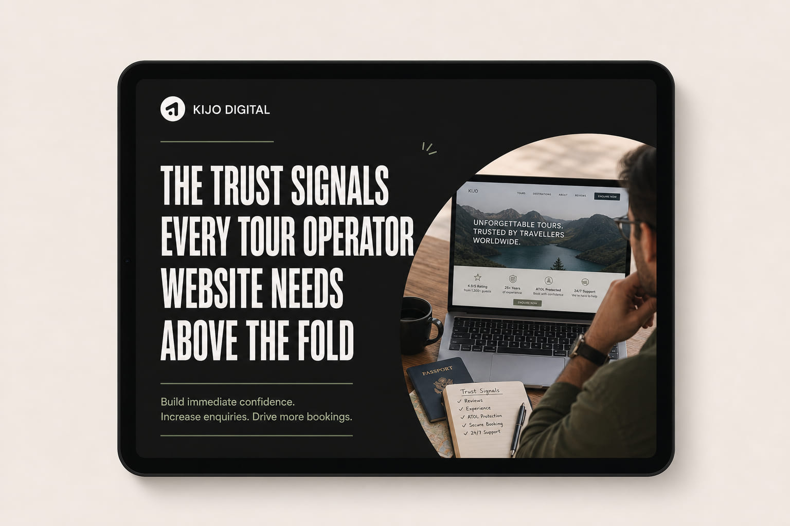
A traveller lands on a tour website already comparing it, consciously or not, against two or three other tabs open on their phone. In the first couple of seconds they’re not reading, they’re scanning for reasons to trust you enough to keep going. If nothing in that first glance answers “is this a real, capable, safe business,” a good chunk of visitors bounce before they ever reach your itinerary, your pricing, or your reviews further down the page.
This is separate from the pricing question covered in why hiding your tour prices costs you bookings. Trust and price transparency work together, but trust comes first: a visitor who doesn’t trust you yet won’t stick around long enough to care what the price is.
“Above the fold” is whatever a visitor sees before scrolling, and since most travellers arrive on mobile, that’s a small space: roughly one phone screen’s worth of hero image, headline and a couple of supporting details. It’s a demanding constraint, but it’s also exactly why it matters. Whatever earns a spot there is, by definition, what you’ve decided matters most in the first two seconds.
A star rating with an actual review count next to it (4.9 · 214 reviews) is processed almost instantly, well before anyone reads your copy. It works as a fast, familiar proxy for quality. A vague claim like "highly rated" without a number reads as evasive, because if the number were good, you'd show it.
Travellers can spot stock photography almost as quickly as they spot a star rating, and it has the opposite effect: a polished stranger in a studio-lit boat or vehicle signals a business hiding behind a template. Your own guides, your own vehicle, your own past guests doing the actual tour reads as real, even when the photo isn't perfectly lit.
"Unforgettable adventures await" could belong to any tour company on earth. A headline that names the actual place, the actual experience, or the actual thing that makes you different signals a real, specific operation rather than a generic template someone filled in.
For anything involving physical activity, wildlife, water or vehicles, a visible mention of guide qualifications, safety certification, or licensing does real work in the first few seconds, because it answers the unspoken question every cautious traveller is quietly asking: is this actually safe.
Years in operation, tours run, or guests hosted are simple, honest numbers that do a surprising amount of trust-building work, particularly for travellers who are naturally wary of newer or less established-looking operators. "Running tours in the Winelands since 2014" says more in six words than a paragraph of marketing copy.
Trust signals only matter if there's an obvious next step once they've worked. A booking button or a direct contact option, visible without scrolling, converts the trust you've just built into an action, rather than leaving a convinced visitor to go hunting for how to actually proceed.
“Above the fold has room for maybe four or five things. Every one of them should be doing trust-building work, not decoration.”
We'll review your site as a first-time visitor would see it and show you exactly what's missing above the fold, free, no obligation.
Open your own homepage on your phone, without scrolling, and tick off what’s genuinely visible.
A crowded hero section that tries to cram in every trust signal at once undermines the same trust it's trying to build. Pick the two or three signals that are currently weakest and add those, rather than stacking all six into an already busy header.
Trust signals above the fold earn a visitor’s benefit of the doubt for the next few seconds, but they need to reappear near every booking button further down the page too, not just at the top. This works alongside the fixes covered in why your tour website isn’t converting, and it’s exactly the kind of thing our conversion rate optimisation work is built around, alongside a tour operator website build or redesign.
It's whatever a visitor sees on their screen before scrolling, on both mobile and desktop. Since most travellers arrive on mobile, above the fold in practice means roughly the first screen height of a phone, which is a small, high-value space.
A visible star rating and review count, ideally with a specific number rather than a vague claim. Travellers use it as a fast proxy for quality before they've read a word of your copy, and its absence is one of the quickest ways to lose a hesitant visitor.
Yes, arguably more. A traveller comparing price alone has no way to judge whether a cheaper tour is actually a worse experience, so trust signals are often what justifies your price rather than competing on it.
Yes. Above the fold earns the initial benefit of the doubt, but reviews, guarantees and safety information should reappear near every booking button further down the page, since that's where the actual decision gets made.
I design and build conversion-focused websites for travel, hospitality and trade businesses, and I've set up bookings on all of these systems, WooCommerce most of all. This comparison reflects what actually works on real operator sites, not vendor marketing.
Book a free 30-minute strategy call. We'll look at your site through a first-time visitor's eyes and show you what's helping, and what's missing.
Book a free strategy call →